User Select
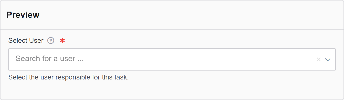
In Authorium's form builder, the User Select component is used to allow form submitters to select one or more users from your organization. This component is commonly used for assigning responsibility, designating approvers, or identifying participants in a process.
The options available to configure the User Select elements are separated into four categories:
- Display
- Validation
- Data
- Conditional
Display
| Parameter | Description |
|---|---|
| Label | The label appears next to a form input field and describes its purpose clearly. |
| Widget Type | Choose the widget style used for displaying the user list. |
| Placeholder | The placeholder text that will appear when this field is empty. It shows an example of what should be inserted. |
| Description | The description is text that will appear below the input field. |
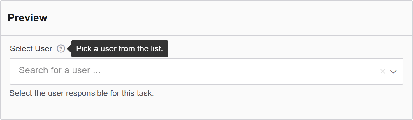
| Tooltip | Enter the text here that will appear as a tooltip to the side of this field. |
| Custom CSS Class | Custom CSS class to add to this component. |
| Hidden | A hidden field that is still a part of the form but is hidden from the user’s view. |
| Hide Label | Hide the label of this component. This allows you to show the label in the form builder but not when it is rendered. |
| Initial Focus | Make this field the initially focused element of this form. |
| Disabled | Disables the form input. |
Data
| Parameter | Description |
|---|---|
| Default Value | The Default Value will be the value for this field before user interaction. Having a default value will override the placeholder text. |
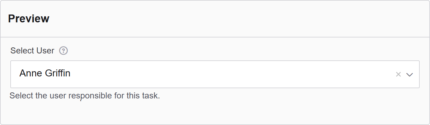
| Value Property | Define which user attribute will be stored when a selection is made. For example: User ID, Username, or Full Name. |
| Clear Value When Hidden | When a field is hidden, clear the value. |
Validation
| Parameter | Description |
|---|---|
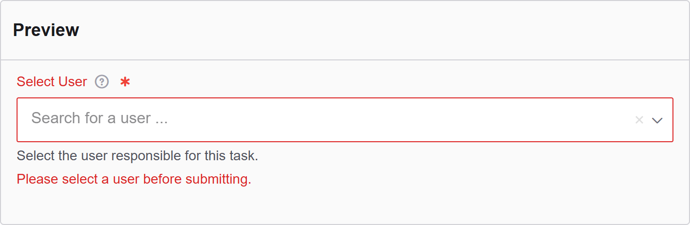
| Required | Check this to make this field as required. The user must fill it out before the form can be submitted. |
| Perform server validation of remote value | Check this to perform a server-side validation ensuring the selected value is valid and exists in the system. Requires a search query to confirm a record is found. |
| Unique | Check this to ensure the data submitted for this field is unique and has not been submitted before. |
| Validate When Hidden | Check this to validate the component when it is hidden/conditionally hidden. Validation errors are displayed in the error alert on the form submission. |
| Error Label | The label for this field when an error occurs. |
| Custom Error Message | Error message displayed if any error occurred. |
Conditional
| Parameter | Description |
|---|---|
| This Component should display | True - the component will display in the form. False - the component will not display. |
| When the form component | Select what component within the form will execute the condition. For example, Submit. |
| Has the value | The data entry of the field that executes the condition. |