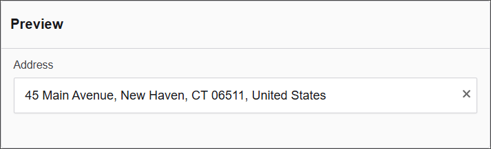
Address
The Address component offers a structured set of fields for users to input comprehensive location information, including street address, city, state, postal code, and country. This component ensures standardized address data collection.
The options available to configure the URL component are separated into five categories:
- Display
- Data
- Provider
- Validation
- Conditional
Display
| Parameter | Description |
|---|---|
| Label | Text label that appears next to the input field. |
| Enable Manual Mode | Enables manual input mode, allowing users to enter values directly. |
| Disable Clear Icon | Hides the clear icon (✕), which normally allows users to quickly clear the input field. |
| Placeholder | Placeholder text displayed when the field is empty. |
| Description | Additional guidance text shown below the input. |
| Tooltip | Helper text displayed on hover for quick hints. |
| Custom CSS Class | Pattern used to format user input visually as they type. |
| Hidden | Keeps the component data but hides it from the user view. |
| Hide Label | Hides the field label on the rendered form. |
| Initial Focus | Sets this field as the first one focused when the form loads. |
| Disabled | Prevents the user from editing the input field. |
Data
| Parameter | Description |
|---|---|
| Multiple Values | Allows users to input more than one value in this field. |
| Default Value | Pre-populates the field with a default value when the form loads. Note that this will override the placeholder text. |
| Clear Value When Hidden | Automatically clears the field’s value if the component becomes hidden. |
Provider
Add here the external geolocation service used to retrieve location data such as coordinates, addresses, or map views. There are four options to configure the Provider in Authorium:
- Custom
- Azure Maps
- OpenStreetMap Nominatim
- Google Maps
Provider: Custom
| Parameter | Description |
|---|---|
| Provider | Set to Custom to define your own API endpoint for retrieving address data. |
| Url | (Required) The full endpoint that will be used to fetch address suggestions or data. Example: https://yourdomain.com/api/addresses. |
| Query Property | The name of the property that will carry the user input in the request. Default: query. |
| Response Property | The key in the API response where the list of results can be found. For example, if your response is { results: [...] }, enter results. |
| Display Value Property | The property within each result object that should be displayed in the dropdown. For instance, if each result is { address: "123 Main St" }, enter address. |
| Params | Optional JSON object containing additional parameters to send with the request. Example: { "region": "Cordoba" }. |
| Manual Mode View String | Optional template string for displaying custom data formats using variables like address, data, or component. Example: "${address}, ${city}". |
Provider: Azure Maps
| Parameter | Description |
|---|---|
| Provider | Set to Azure Maps to use Microsoft Azure's address lookup service. |
| Subscription Key | (Required) Your Azure Maps subscription key, used to authenticate API requests. Must be obtained from the Azure Portal. |
| Manual Mode View String | Optional template string for displaying address data manually. Supports variables like address, data, and component to customize how the address is shown. Example: "${address}, ${postalCode}". |
Provider: OpenStreetMap Nominatim
| Parameter | Description |
|---|---|
| Provider | Set to OpenStreetMap Nominatim to use the public Nominatim geocoding service from OpenStreetMap. |
| Manual Mode View String | Optional template string to format how the address is displayed. You can use variables like address, data, and component to personalize the output. Example: "${address.road}, ${address.city}". |
Provider: Google Maps
| Parameter | Description |
|---|---|
| Provider | Set to Google Maps to use Google’s geocoding services. Requires a valid API key. |
| API Key | Your Google Maps API key. This is required to enable the geolocation service. |
| Provider options | Optional JSON object for advanced configuration. Leave as {} if not needed. |
| Manual Mode View String | Optional template string to define how the address is displayed manually. You can reference address, data, and component variables. Example: "${address.street_number} ${address.route}". |
Validation
| Parameter | Description |
|---|---|
| Required | Makes this field mandatory before form submission. |
| Unique | Ensures the entered value has not been submitted before. |
| Validate When Hidden | Validates the field even when it’s not visible on the form. |
| Error Label | Custom label shown when a validation error occurs. |
| Custom Error Message | Displays a personalized message when the field fails validation. |
Conditional
| Parameter | Description |
|---|---|
| This Component should display | True - the component will display in the form. False - the component will not display. |
| When the form component | Select what component within the form will execute the condition. For example, Submit. |
| Has the value | The data entry of the field that executes the condition. |