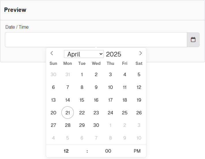
Date/Time
The Date / Time component provides users with a combined date and time picker, facilitating the selection of specific timestamps. It supports various formats and can be configured to restrict selectable ranges, enhancing scheduling functionalities.
The options available to configure the URL component are separated into six categories:
- Display
- Date
- Time
- Data
- Validation
- Conditional
Display
| Parameter | Description |
|---|---|
| Label | Text label that appears next to the input field. |
| Display in Timezone | Displays the value in the selected Timezone. You can choose between Viewer, Submission, Location, and UTC. |
| Use Locale Settings | Displays Date and Time according to Local Settings. |
| Allow Manual Input | Allows the user to manually enter these values. |
| Format | Defines the display format of the date and time. Example: yyyy-MM-dd hh:mm a (e.g., 2025-04-21 03:45 PM). |
| Placeholder | Placeholder text displayed when the field is empty. |
| Description | Additional guidance text shown below the input. |
| Tooltip | Helper text displayed on hover for quick hints. |
| Custom CSS Class | Pattern used to format user input visually as they type. |
| Hidden | Keeps the component data but hides it from the user view. |
| Hide Label | Hides the field label on the rendered form. |
| Initial Focus | Sets this field as the first one focused when the form loads. |
| Disabled | Prevents the user from editing the input field. |
Date
| Parameter | Description |
|---|---|
| Enable Date Input | Allows users to select or enter dates. |
| Disable Specific Dates or Dates by Range | Prevents selection of individual dates or defined ranges. Accepted formats for disabling dates or ranges: (yyyy-MM-dd) or (yyyy-MM-dd - yyyy-MM-dd). |
| Disable Weekends | Blocks selection of Saturdays and Sundays. |
| Disable Weekdays | Blocks selection of Monday through Friday. |
Time
| Parameter | Description |
|---|---|
| Enable Time Input | A checkbox to activate or deactivate the time input field. If unchecked, time input is not shown on the form. |
| Hour Step Size | Defines the increment in hours for the time selector (e.g., setting to "1" allows selecting times like 1:00, 2:00, etc.). |
| Minute Step Size | Defines the increment in minutes for the time selector (e.g., setting to "15" allows selecting 1:00, 1:15, 1:30, etc.). |
| 12 Hour Time (AM/PM) | A checkbox that enables 12-hour time format with AM/PM instead of 24-hour format. |
Data
| Parameter | Description |
|---|---|
| Multiple Values | A checkbox that allows the field to accept more than one value (e.g., multiple times can be selected). |
| Default Value | Sets an initial value for the field when the form loads. Can be manually entered or selected via the calendar picker. |
| Clear Value When Hidden | A checkbox that clears the field’s value if the field becomes conditionally hidden on the form. |
Validation
| Parameter | Description |
|---|---|
| Required | A checkbox that makes the field mandatory. Users must fill it before submitting the form. |
| Use calendar to set minDate | Allows setting the earliest valid date/time using a calendar picker. |
| Use calendar to set maxDate | Allows setting the latest valid date/time using a calendar picker. |
| Unique | Ensures that the value entered in this field is not duplicated across other form entries. |
| Validate When Hidden | If checked, validation rules will apply even when the field is hidden via conditional logic. |
| Error Label | A label shown next to the field when a validation error occurs. Helps identify the error source. |
| Custom Error Message | A specific message displayed when validation fails. Replaces default error text. |
Conditional
| Parameter | Description |
|---|---|
| This Component should display | True - the component will display in the form. False - the component will not display. |
| When the form component | Select what component within the form will execute the condition. For example, Submit. |
| Has the value | The data entry of the field that executes the condition. |