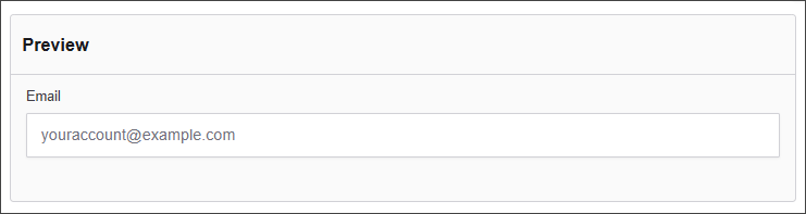
Emails
The Email component enables users to input and validate email addresses within a form. It ensures the entered data conforms to standard email formatting, enhancing data integrity and facilitating effective communication workflows.
The options available to configure the Email component are separated into four categories:
- Display
- Data
- Validation
- Conditional
Display
| Parameter | Description |
|---|---|
| Label | Text label that appears next to the input field. |
| Placeholder | Placeholder text displayed when the field is empty. |
| Description | Additional guidance text shown below the input. |
| Tooltip | Helper text displayed on hover for quick hints. |
| Prefix | Text or symbol shown before the input (e.g., @, $). |
| Suffix | Text or symbol shown after the input (e.g., .com, kg). |
| Display Mask | A display mask helps to display the input in a readable way. This won't affect the value which will be saved (to affect both view and saved value, delete Display Mask and use Input Mask). 9: numeric a: alphabetical *: alphanumeric Example telephone mask: (999) 999 - 999 |
| Custom CSS Class | Pattern used to format user input visually as they type. |
| Autocomplete | Enables or disables browser autocomplete suggestions. |
| Hidden | Keeps the component data but hides it from the user view. |
| Hide Label | Hides the field label on the rendered form. |
| Hide Input | Hides the input field from the UI (data is still captured). |
| Initial Focus | Sets this field as the first one focused when the form loads. |
| Allow Spellcheck | Enables the browser's built-in spellchecking. |
| Disabled | Prevents the user from editing the input field. |
Data
| Parameter | Description |
|---|---|
| Multiple Values | Allows users to input more than one email address in this field. |
| Default Value | Pre-populates the field with a default value when the form loads. Note that this will override the placeholder text. |
| Text Case | Sets how text is formatted: Mixed (default), Uppercase, or Lowercase. |
| Truncate Multiple Spaces | Collapses multiple spaces into a single space within the input. |
| Clear Value When Hidden | Automatically clears the field's value if the component becomes hidden. |
Validation
| Parameter | Description |
|---|---|
| Required | Makes this field mandatory before form submission. |
| Unique | Ensures the entered value has not been submitted before. |
| Validate When Hidden | Validates the field even when it’s not visible on the form. |
| Kickbox | Uses Kickbox to verify if the email address is deliverable. |
| Minimum Length | Sets the smallest number of characters allowed. |
| Maximum Length | Limits the input to a maximum number of characters. |
| Regular Expression Pattern | Validates the field’s input. The value must match this pattern before the form can be submitted. |
| Error Label | Custom label shown when a validation error occurs. |
| Custom Error Message | Displays a personalized message when the field fails validation. |
Conditional
| Parameter | Description |
|---|---|
| This Component should display | True - the component will display in the form. False - the component will not display. |
| When the form component | Select what component within the form will execute the condition. For example, Submit. |
| Has the value | The data entry of the field that executes the condition. |