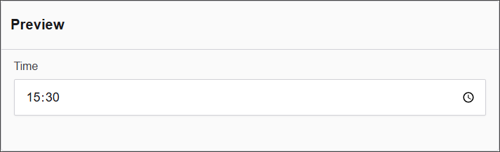
Time
The Time component enables users to input a specific time of day. It supports various time formats and can be configured to limit input to certain intervals, making it suitable for scheduling and time-specific data collection.
The options available to configure the URL component are separated into four categories:
- Display
- Data
- Validation
- Conditional
Display
| Parameter | Description |
|---|---|
| Label | Defines the label text for the input (e.g., Time). |
| Input Type | Specifies the type of widget (e.g., Text Input with Mask). |
| Format | Defines the format for the input (e.g., HH:mm). |
| Description | Provides a description for the field (e.g., Description for this field). |
| Tooltip | Provides a tooltip for the field (e.g., To add a tooltip to this field, enter text here). |
| Custom CSS Class | Defines a custom CSS class for styling the input field. |
| Hidden | A checkbox to make the field invisible on the form, useful for conditional logic or storing hidden values. |
| Hide Label | Hides only the label (not the input itself), often used when labels are shown in a different way. |
| Initial Focus | If checked, this field will automatically gain focus when the form loads. |
| Disabled | Makes the field non-editable and visually indicates that it is disabled to the user. |
Data
| Parameter | Description |
|---|---|
| Multiple Values | A checkbox option to allow multiple values to be selected. |
| Default Value | Defines the default value for the input (e.g., Default Value). |
| Clear Value When Hidden | A checkbox option to clear the value when the field is hidden. |
Validation
| Parameter | Description |
|---|---|
| Required | A checkbox option to make the field required. |
| Unique | A checkbox option to ensure the value is unique. |
| Validate When Hidden | A checkbox option to validate the input even when it is hidden. |
| Error Label | Defines a custom label for the error message. |
| Custom Error Message | Defines the custom error message that will be displayed. |
Conditional
| Parameter | Description |
|---|---|
| This Component should display | True - the component will display in the form. False - the component will not display. |
| When the form component | Select what component within the form will execute the condition. For example, Submit. |
| Has the value | The data entry of the field that executes the condition. |