Checkbox
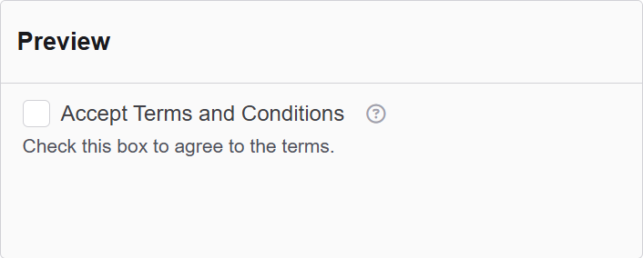
The Checkbox component in Authorium's form builder is an input element that allows users to select or toggle options. This component is commonly used for agreeing to terms and conditions, selecting multiple choices, or enabling specific settings in a form.
The options available to configure the Text Area elements are separated into four categories:
- Display
- Data
- Validation
- Conditional
Display
| Parameter | Description |
|---|---|
| Label | The label appears next to a form input field and describes its purpose clearly. |
| Description | The description is text that will appear below the input field. |
| Tooltip | Enter the text here that will appear as a tooltip to the side of this field. |
| Input Type | This is the input type used for this checkbox. |
| Custom CSS Class | Custom CSS class to add to this component. |
| Hidden | A hidden field that is still a part of the form but is hidden from the user’s view. |
| Hide Label | Hide the label of this component. This allows you to show the label in the form builder but not when it is rendered. |
| Initial Focus | Make this field the initially focused element of this form. |
| Disabled | Disables the form input. |
Data
| Parameter | Description |
|---|---|
| Default Value | The Default Value will be the value for this field before user interaction. Having a default value will override the placeholder text. |
| Clear Value When Hidden | When a field is hidden, clear the value. |
Validation
| Parameter | Description |
|---|---|
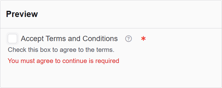
| Required | Check this to make this field as required. The user must fill it out before the form can be submitted. |
| Validate When Hidden | Check this to validate the component when it is hidden/conditionally hidden. Validation errors are displayed in the error alert on the form submission. |
| Error Label | The label for this field when an error occurs. |
| Custom Error Message | Error message displayed if any error occurred. |
Conditional
| Parameter | Description |
|---|---|
| This Component should display | True - the component will display in the form. False - the component will not display. |
| When the form component | Select what component within the form will execute the condition. For example, Submit. |
| Has the value | The data entry of the field that executes the condition. |