Radio
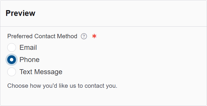
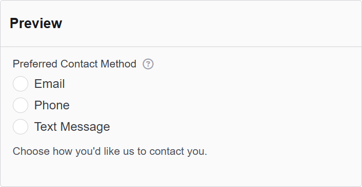
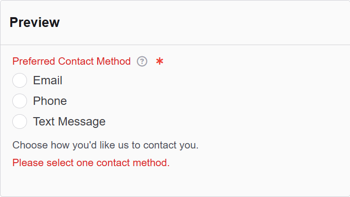
The Radio component in Authorium's form builder allows users to select a single option from a predefined list. This component is useful when only one choice should be allowed among multiple options, such as selecting a preferred contact method, choosing a subscription plan, or setting a default option.
The options available to configure the Text Area elements are separated into four categories:
- Display
- Data
- Validation
- Conditional
Display
| Parameter | Description |
|---|---|
| Label | The label appears next to a form input field and describes its purpose clearly. |
| Description | The description is text that will appear below the input field. |
| Tooltip | Enter the text here that will appear as a tooltip to the side of this field. |
| Custom CSS Class | Custom CSS class to add to this component. |
| Inline Layout | Displays the checkboxes/radios horizontally. |
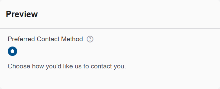
| Hidden | A hidden field that is still a part of the form but is hidden from the user’s view. |
| Hide Label | Hide the label of this component. This allows you to show the label in the form builder but not when it is rendered. |
| Initial Focus | Make this field the initially focused element of this form. |
| Disabled | Disables the form input. |
Data
| Parameter | Description |
|---|---|
| Data Source Type | The source to use for the select data. Values lets you provide your own values and labels. JSON lets you provide raw JSON data. URL lets you provide a URL to retrieve the JSON data from. |
| Default Value | The Default Value will be the value for this field before user interaction. Having a default value will override the placeholder text. |
| Values | The radio button values that can be picked for this field. Values are text submitted with the form data. Labels are text that appears next to the radio buttons on the form. |
| Storage Type | The type to store the data. If you select something other than autotype, it will force it to that type. |
| Clear Value When Hidden | When a field is hidden, clear the value. |
Validation
| Parameter | Description |
|---|---|
| Required | Check this to make this field as required. The user must fill it out before the form can be submitted. |
| Validate When Hidden | Check this to validate the component when it is hidden/conditionally hidden. Validation errors are displayed in the error alert on the form submission. |
| Minimum Value | Enter a minimum allowable value for this field. |
| Maximum Value | Enter a maximum allowable value for this field. |
| Error Label | The label for this field when an error occurs. |
| Custom Error Message | Error message displayed if any error occurred. |
Conditional
| Parameter | Description |
|---|---|
| This Component should display | True - the component will display in the form. False - the component will not display. |
| When the form component | Select what component within the form will execute the condition. For example, Submit. |
| Has the value | The data entry of the field that executes the condition. |