Table
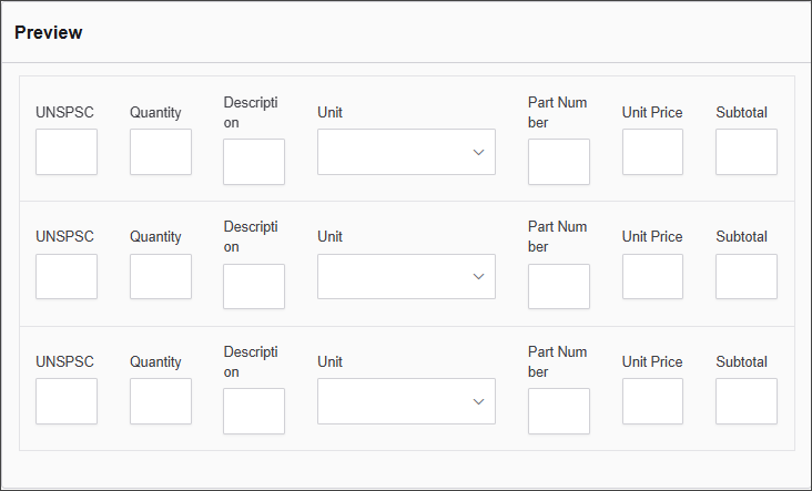
The Table Component allows you to create a grid structure within a form, ideal for organizing content into rows and columns. It supports customization of appearance and behavior, including alignment, styling options, and component duplication per row.
The options available to configure the Panel element are separated into two categories:
-
Display
-
Conditional
Display
| Parameter | Description |
|---|---|
| Label | The name of the table displayed at the top of the component. |
| Number of Rows | Defines how many horizontal rows the table should have. |
| Number of Columns | Defines how many vertical columns the table should contain. |
| Clone Row Components | When enabled, components added to one row are cloned to the rest. |
| Cell Alignment | Sets the text alignment within each cell (Left, Center, or Right). |
| Custom CSS Class | A custom class name for styling the component. |
| Striped | Adds alternating background colors to rows for readability. |
| Bordered | Adds borders around all cells. |
| Hover | Highlights rows when hovered over with the mouse. |
| Condensed | Reduces cell padding to make the table more compact. |
| Hidden | Hides the table from view on the form. |
Conditional
| Parameter | Description |
|---|---|
| This Component should display | True - the component will display in the form. False – the component will not display. |
| When the form component | Select what component within the form will execute the condition. For example, Submit. |
| Has the value | The data entry of the field that executes the condition. |